Blur · August 20, 2026
How to deblur a picture when the letters have an answer
How to deblur a picture of a shop sign from a moving bus, using the letters as the test a pretty result can still fail.
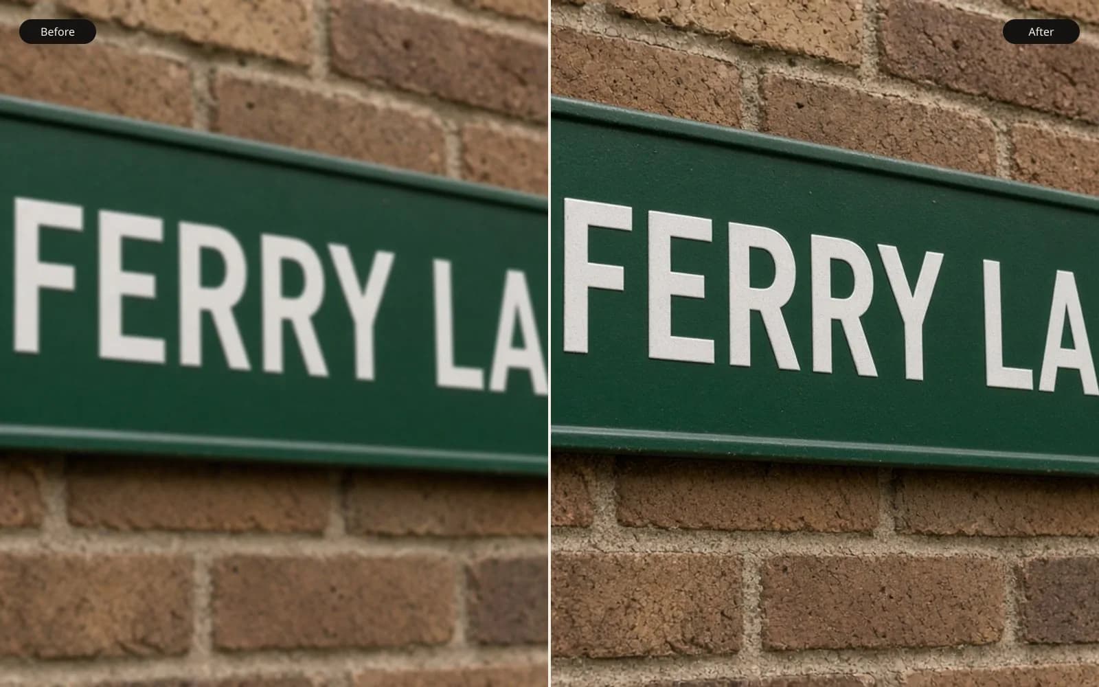
Letters are the honest test, because you know what they should say. Deblur the picture and read them before you download.
I needed a method for how to deblur a picture, and I did not want the method to be a face. Faces let a sharp guess hide. I was on a bus, the bus was moving, and I photographed a painted sign on a wall as we passed. The sign says FERRY LANE TIMBER. I know that because I read it when we stopped at the next light, and I typed it into a note before I opened an editor. The letters are the test. If a deblur is sharp and the word is wrong, the deblur failed.
TL;DR. A phone frame at 1/30 from a moving bus smeared FERRY LANE TIMBER horizontally by about 28 pixels. I wrote the spelling down first. A classical deconvolution with a 28 pixel horizontal kernel tightened the letters, left a faint ghost, and kept the Y a Y. The same method at 40 pixels doubled the strokes and was worse than the original. A learned deblur looked best at thumbnail size and turned the Y toward a T. Sharpening without a kernel only outlined the smear. The word in the note is the grade. A pretty file that fails the word does not get delivered.
The frame and the note
The file is bus-ferry.jpg, a phone JPEG, 4032 by 3024, 2.9 megabytes, 1/30 second. I was a passenger. The sign is on a side street wall, dark condensed letters on a pale board, large enough that the word fills a useful crop. The bus was not braking hard. The smear is horizontal and fairly even, which is what a steady roll past a wall looks like. This is not camera shake in the sense of my hands. My hands were braced on the seat. The world moved. For the sign, that is the same geometry as a camera that slid sideways, and it is not the same job as a person walking through a sharp room.
I measured the smear on the crop, not on the whole 4032-wide frame, so I would not mix "28 pixels" with a different scale later. The crop is bus-ferry-crop.tif, 16-bit, 1400 by 420, 3.5 megabytes, cut from a conversion of the JPEG with no extra sharpening. 1400 times 420 times six is about 3.5 megabytes. Good. The vertical stroke of the M in TIMBER, which should be a narrow dark bar, is a horizontal blob. I called the drag about 28 pixels by looking at where the dark paint fades into the board on the left of that stroke. It is an estimate. The true stroke has width, so 28 includes a few pixels of paint. I will try neighbors. I will not pretend the fade has a single pixel I can swear to.
The note is bus-ferry.txt and the first line is the spelling in capitals, typed while I could still see the sign from the stop, not while I could see a deblurred preview. That order matters. If I look at a sharp guess first, I will "remember" the guess. The second line is the shutter and the 28. The third line is a smaller sign in the window of the same shop, a neon OPEN, which is closer to the bus and out of focus. OPEN is not the motion test. I wrote it down so I would not try to make one kernel explain both.
There is also a reflection in the window, the pale interior of the bus, including a vertical smear of the handrail. I am not deblurring the reflection. It is a second exposure added on top of the glass. A kernel for the sign will treat the reflection as structure and worm it. I crop it out of the test. The crop is the letters and a margin of board, nothing else.
What classical deconvolution is actually doing
Classical deconvolution does not know the alphabet. It knows a kernel and a blurry picture. The kernel is the smear described as weights. Mine is a horizontal line, 28 pixels long, weights roughly equal, because the bus did not pause inside that 1/30. If the bus had slowed at the end of the exposure, the weights would pile up at one side. I do not see that pile-up on the M. The fade is fairly symmetric. Equal weights are a fair start.
The blurry letter is what you get if you take a sharp letter and replace each pixel with a horizontal average, 28 long. Deconvolution asks for a sharp letter that, once averaged that way, lands on the pixels I have. That question can have more than one answer. The methods differ in which answer they prefer when the arithmetic gets unstable.
Richardson-Lucy, the iterative one I ran first, starts with a guess and blurs the guess with the kernel. Where the blurred guess is brighter than the photograph, it turns the sharp guess down. Where it is darker, it turns the sharp guess up. Then it repeats. It never "reads" FERRY. It only chases the totals. After enough iterations the letters tighten, and if I let it run past the point of sense it starts fitting noise in the board and the counters of the letters fill with grit. I stopped when the holes in the R and the A were open and the board was still a board.
Wiener deconvolution does the undo more directly and turns the gain down where the blur has destroyed detail, so a speck in the board does not become a stripe. The damping is a compromise I set by looking, not by a formula I will pretend is universal. Less damping, stronger letters, more ringing. More damping, softer letters, a quieter board. I kept the version where a faint light-and-dark echo sits to the left of the strokes and the board is not striping. The echo is about the length of the kernel, which is the signature of a kernel that is close and not perfect. A perfect kernel on a noiseless file would not need this paragraph. Phone JPEGs are not that file.
Neither method is allowed to invent a serif the paint did not have, except by ringing, and ringing looks like an echo, not like a new letter. That limit is the virtue. The classical result can be ugly and still be checkable. It does not get fluent.
Three lengths, and the spelling
bus-ferry-lucy-28.png is the Richardson-Lucy result at 28 pixels. bus-ferry-wiener-28.png is the damped one-step result at the same length. Both are 1400 by 420. The PNG sizes are 1.1 and 0.9 megabytes, larger than a JPEG would be because I did not want another compression on top of the test.
I read them against the note, letter by letter, at 100 percent.
F is F. The top bar and the middle bar are separate. In the original crop they had bled toward each other.
E is E. Three bars, two gaps. The gaps are dirty. They are gaps.
R is R. The leg is there, the bowl is there. The leg is the stroke a blur loves to detach, and it did not detach.
Y is Y. The fork is a fork, not a vertical stem with a crossbar. This is the letter I am going to use as the tripwire later. It is correct here.
A space, then LANE. The A is open. The N is an N, not a smear that could be an H. E is E.
TIMBER. The M has two valleys, not three. The B's bowls are two. The verticals are still a little fat, which is the remaining uncertainty about the true stroke width, and they are single.
Both classical files pass the word. The Lucy file is a bit grittier in the board and the counters are a bit cleaner. The Wiener file is calmer and the ghost to the left of the M is more obvious. I prefer the Wiener file for anyone who has to look at it, and I trust them equally on the spelling. The ghost is a defect I can name. It is not a wrong letter.
bus-ferry-lucy-16.png used 16 pixels. The word is still soft. The A is not really open. The Y is a blob with a hint of a fork. This is the original, slightly tightened. It does not fail the spelling because it does not yet make strong claims. It also does not finish the job. Too short is a shy pass, not a different word.
bus-ferry-lucy-40.png used 40 pixels. Every vertical stroke splits. The M is two M's offset sideways. FERRY reads as a double exposure. The holes in the letters break into pairs of holes. This is worse than bus-ferry-crop.tif, which at least looks like one smeared word. A long kernel does not "try harder." It subtracts a smear that was not there, and the subtraction leaves a copy. I rejected 40 in about ten seconds, which is the correct amount of time. How to deblur a picture includes knowing when the length is the enemy.
I did not average 28 and 40. I did not run 40 "just for the thumbnail." The thumbnail of the 40 pixel file looks detailed in a disastrous way, like a text effect. Thumbnail is a bad judge of doubled strokes. I judge at 100 percent, against the note.
What the learned pass did to the Y
The learned result is bus-ferry-learned.jpg, 1400 by 420, 380 kilobytes. I ran it on the same crop, on the unblur tool and checked the same crop against fix blurry photo, so I could see the original beside the guess. At fit-to-window it is the best-looking file in the folder. The board is clean. The letters are dark and even. A person who did not have the note would call it the winner in a second.
At 100 percent the Y in FERRY is wrong. The fork has been joined by a vertical stem, so the letter is halfway to a T, and at thumbnail size, which is how this file wins, FERRY reads as FERRT if I am being honest and as FERRY only if I already know the word. I covered the rest of the word with a piece of paper and asked myself what the letter was. I said T. The note says Y. The learned file fails.
The rest of the word is mostly right, which is how the failure hides. LANE is LANE. TIMBER is TIMBER, and the M still has two valleys. The model did not collapse. It got fluent on a letter whose smeared shape, a forked blob, is also the smeared shape of a T, and it picked the more common stem. I do not need to claim it "thought" of the letter T. I need to claim the pixels are closer to T than to the Y on the wall. Can AI unblur an image is the same behaviour on a face, where the common version of an eye replaces the eye you had. On a sign I can see it without a family argument. The Y is the argument.
There is a second, smaller tell. The learned A in LANE is a tidy triangle with a bar that is perfectly level. The painted A on the wall, visible in the classical result and in the original if you know to look, has a bar that tilts up to the right, a flaw in the signwriting. The learned file levelled it. That is a small kindness and it is a change. I would not fail the file on the tilt alone. I fail it on the Y. The tilt is corroboration that the model is normalising the sign toward a standard alphabet, not only undoing a 28 pixel average.
The classical files kept the tilt. They also kept the ghost. I will take a ghost and a tilted bar and a true Y over a clean T.
OPEN was a different blur
The neon OPEN in the window is a disk, not a line. The tubes are out of focus. The bus motion is in there too, but the thickness of the tubes is mostly defocus, and the color bleeds in a way the painted sign does not. I ran the 28 pixel horizontal kernel on a crop of OPEN, bus-ferry-open-crop.tif, 600 by 300, because I wanted the failure on disk.
bus-ferry-open-lucy-28.png turned the tubes into horizontal echoes. O became a stack of smeared repeats. It did not become more readable. A motion kernel applied to a disk is the wrong instrument, and the picture gets louder. I stopped. OPEN stays out of focus in the delivery, or out of the delivery. I am not asking a learned model to guess the word OPEN either. It is a common word, and a model would be delighted to produce it from almost any blob of neon. That would be a correct guess and still not a measurement, and I do not need it. The painted sign is the test I can stand behind.
Sharpening, which is not this method
I made one unsharp-mask version, bus-ferry-usm.jpg, small radius, moderate amount, so I would have the file people mean when they say the sign just needs to be crisper. The smeared strokes grew light and dark outlines. FERRY became a bolder smear. The Y's fork did not return. The outlines make the thumbnail look purposeful, like a logo that was always soft. At 100 percent the letters are traced, not deblurred.
That distinction is the whole of how to sharpen a blurry picture, and I am glad I had the sign for it. On a face, the outlined smear reads as a jaw. On FERRY it reads as a marker pen drawn over a mistake. How can I remove blur from a picture is the neighboring case, a vertical camera shake on a street, where the clue is a highlight streak rather than a word I can spell. The arithmetic is related. The test is different. I do not grade the street frame by whether a shop name survived. I grade this crop by nothing else.
A second sharpen on top of the Wiener file, which I tried as bus-ferry-wiener-28-usm.jpg and then rejected, drew the ghost more clearly. The echo to the left of the M became a second M. Sharpening a deconvolution's leftover ring is how you spend the spelling on a halo. The Wiener file was already as far as I wanted to go.
I read the crop in this order, and I stop at the first failure:
- The note's spelling, letter by letter, at 100 percent.
- The Y in FERRY, which is the letter a fluent pass is likely to stem.
- The counters of A, R, and B, which should open without doubling.
- The board, which may show a faint echo and may not turn into stripes.
| Method | Kernel | FERRY's Y | Ghost or invented stroke | Word matches the note |
|---|---|---|---|---|
| Original crop | none | Fork, smeared | No | Yes, if you already know it |
| Lucy, 16 px | horizontal, too short | Still a blob | No | Barely, not finished |
| Lucy, 28 px | horizontal, measured | Fork | Mild grit in the counters | Yes |
| Wiener, 28 px | horizontal, damped | Fork | Faint echo left of the strokes | Yes |
| Lucy, 40 px | horizontal, too long | Doubled | Parallel copies of every stroke | No |
| Learned | none I can read | Stem, reads as T | Levelled the tilted A | No |
| Unsharp mask | none | Outlined smear | Halos, no new letter | No, just bolder |
What I delivered
I delivered bus-ferry-wiener-28.png next to the original crop and the note. I did not deliver the learned JPEG. I did not deliver the 40 pixel file as a "more processed" alternative, because alternatives that fail the word get used by accident when someone likes the contrast. The learned file stays in experiments/rejected/ with the line "Y reads as T" in the note. That line is more useful than the JPEG.
The full frame bus-ferry.jpg is untouched. The sign crop is a crop. I am not writing the deconvolved letters back over the JPEG as if the bus interior and the reflection had been solved. They have not. A delivery that pastes sharp type onto a blurry street is a collage. If the picture is the sign, the crop is the picture. If the picture is the bus ride, the smear is the picture, and deblur is the wrong request.
I printed the Wiener crop at 6 inches wide. The ghost is visible if I point at it, and the word is the word. The learned print at the same size hides the T-shaped Y. That is the dangerous print. Small size is where a wrong letter looks like design. I showed both to a friend and asked them to read the first word without context. Wiener: ferry. Learned: ferrt, then a correction once I raised an eyebrow. I am not going to pretend that is a study. It is one sign and one friend. It matched the paper test I had already done, which is all I needed.
What I will reuse from this afternoon
I will reuse the order. Read the letters, write them down, then touch the file. Estimate the length on a stroke that should have been thin. Run the length, a shorter one, and a longer one. Keep the length that opens the counters without doubling the strokes. Treat a learned result as a second opinion that must spell the same word, not as an upgrade.
I will reuse the refusal. A kernel fit to motion does not get applied to a defocused neon word on the same street. A sharpen does not get to be the deblur. A thumbnail does not get a vote.
I will not reuse the 28 as a constant. The next bus, the next shutter, the next distance to the wall, and 28 is nonsense. The method is the measurement and the spelling. The number is local to bus-ferry-crop.tif.
How to deblur a picture, when the picture contains language, is a spelling test with an optional kernel. When the picture contains a person, I do not get the spelling test, and I borrow the stricter habits anyway: write down a mark before the model runs, reject fluency that moves the mark, keep the ghost if the ghost is honest. The sign is simply the place those habits are easy to explain, because FERRY is not a matter of taste. It is the word on the wall, and I wrote it down while the bus was stopped.
Questions that come up after the file is open
Why use letters to test a deblur?
Because a letter is either the letter I read or it is not. A face can look plausibly sharp and be a slightly different face. On this sign I typed FERRY LANE TIMBER into a note before I ran anything, and that note is the answer key.
What does a classical deconvolution need?
A kernel, a description of the smear. I used a horizontal run of about 28 pixels, because the bus motion was steady and a vertical stroke had been dragged sideways by about that much. The method then tries to find a sharper image that would blur into the file I have.
How can a learned deblur look sharp and still fail?
It can invent a stroke that makes a crisp wrong letter. On this crop the Y in FERRY grew a stem and started to read as a T at thumbnail size. The file looked successful until I checked it against the note.
What if I guess the wrong blur length?
The letters split into parallel copies. A kernel of 40 pixels on a 28 pixel smear doubled the strokes and was worse than doing nothing. Too short a kernel simply left the word soft, and wrong is not a milder right.